
Honoring the Shield:
A Deep Dive into the New Vintage & Modern Police Badge Collection
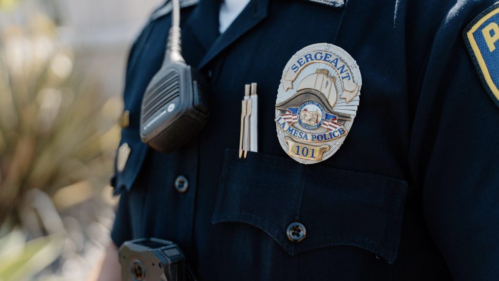
Police badges represent more than a department name or a professional title. Their shapes, metal finishes, lettering, and decorative details reflect the history, identity, and traditions of the organizations they represent. From classic shield badges inspired by early law enforcement designs to modern badges with clean lines and precise detailing, each style offers a different way to communicate authority, service, and institutional pride.
The new Vintage & Modern Police Badge Collection explores these two design directions through distinctive shapes, finishes, raised details, and color combinations. Whether a project focuses on historical presentation, departmental recognition, commemorative gifts, or collectible displays, understanding the differences between vintage and modern badge styles helps buyers make more informed design decisions.
Vintage Police Badges: Preserving a Timeless Tradition
Vintage-style police badges draw inspiration from traditional law enforcement insignia, including classic shield shapes, ornamental borders, engraved lettering, and contrasting metallic finishes. Their appeal comes from a sense of history and craftsmanship. Rather than relying on a minimalist appearance, these designs often use multiple decorative elements to create visual depth and character.
Antique gold, antique silver, and aged brass finishes are common choices for a traditional appearance. Dark blue, black, and other deep enamel colors can provide contrast against raised metal lettering and emblems. Rope-style borders, ornamental scrollwork, and carefully arranged text can further reinforce the historical aesthetic.
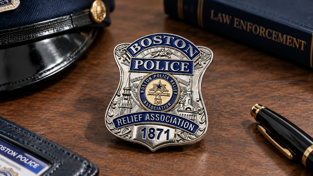
The Boston Police Relief Association 1871 badge, for example, illustrates how a traditional shield silhouette, dark blue background, metallic details, and historical lettering can work together to create a distinctive commemorative design. Its visual character comes from the relationship between these elements rather than from any single decorative feature.
Vintage styling is particularly suitable for historical collections, anniversary projects, heritage displays, and recognition pieces that celebrate an organization’s legacy. Buyers can also adapt traditional design principles for fictional organizations or privately commissioned collectibles.
When developing a vintage-inspired badge, it is important to establish a clear visual hierarchy. Too many ornamental details can make small lettering difficult to read. A balanced layout, suitable relief depth, and carefully selected finishes help preserve the traditional look without sacrificing legibility.
Modern Police Badges: A Clearer, Contemporary Look
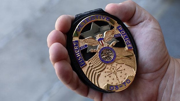
Modern police badge designs generally emphasize clarity, balanced proportions, and a more streamlined arrangement of visual elements. Although shields remain a familiar silhouette, contemporary designs may feature simplified borders, cleaner typography, geometric details, and more controlled use of color.
Polished silver, bright gold, and black nickel can produce different visual effects. Bright metallic finishes create a crisp, reflective appearance, while darker finishes offer a more restrained, contemporary character. Enamel colors can distinguish sections of the design, highlight an emblem, or create contrast around lettering.
Modern styling does not necessarily mean removing all decorative details. Instead, the objective is to make each element serve a clear purpose. A central emblem can become the primary focal point, while the organization name, department designation, or commemorative wording follows a consistent visual structure.
This approach can be useful for newly established organizations, contemporary commemorative collections, departmental recognition projects, and custom designs intended to complement modern visual identities. It can also work well when a badge needs to remain visually clear in photographs or when displayed alongside other pieces in a collection.
For buyers planning a modern badge, typography deserves particular attention. Narrow lettering, closely spaced characters, and long organization names can become difficult to reproduce at small sizes. Simplifying secondary text or increasing the available space around key elements can improve readability.
The strongest modern designs combine a recognizable outline with restrained decoration and deliberate use of contrast. They feel contemporary without losing the distinctive character that makes a badge visually meaningful.
Comparing Vintage and Modern Badge Styles
Vintage and modern styles offer different advantages, but neither is automatically better. The right choice depends on the intended audience, visual identity, display setting, and purpose of the project.
| Design feature | Vintage style | Modern style |
|---|---|---|
| Overall appearance | Traditional and ornamental | Clean and streamlined |
| Common shapes | Classic shields and traditional crests | Simplified shields and geometric variations |
| Metal finishes | Antique gold, antique silver, aged brass | Polished gold, bright silver, black nickel |
| Decorative details | Engraved borders, scrollwork, layered relief | Clean lines, simplified emblems, balanced geometry |
| Color treatment | Deep enamel tones with metallic contrast | Selective accent colors and defined color blocks |
| Typography | Traditional lettering and commemorative text | Clear, structured, contemporary lettering |
| Suitable projects | Heritage displays, anniversaries, historical collectibles | Contemporary recognition, modern collections, new identities |
These categories are design directions rather than strict manufacturing rules. A vintage badge can use polished metal, while a modern badge can incorporate antique finishes. Combining elements from both styles may create a more distinctive result.
For example, a traditional shield outline paired with simplified lettering can retain a historical silhouette while improving readability. Similarly, a contemporary emblem with an antique silver finish can introduce a sense of heritage without requiring elaborate ornamentation.
Before selecting a style, buyers should identify the most important design priority. If the project celebrates a long organizational history, traditional details may carry greater meaning. If the design needs to communicate a contemporary identity, a simpler composition may be more appropriate.
Reference images, sketches, and clear notes about preferred finishes help communicate these priorities before production begins.
Metal Finishes and Raised Details: Building Visual Depth
Metal finishing plays a major role in the appearance of a custom badge. The same artwork can look noticeably different depending on whether the surface is polished, brushed, antiqued, or treated with a darker metallic finish. Choosing a finish should therefore be part of the design process, not an afterthought.
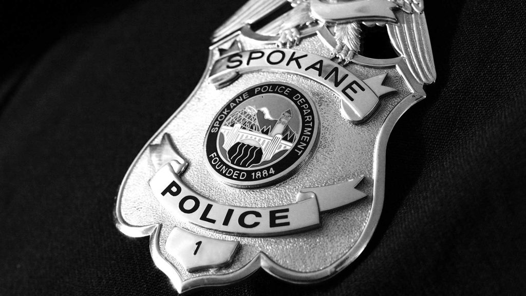
Polished gold and silver provide a bright, reflective appearance that emphasizes raised details. Antique finishes create contrast between higher surfaces and recessed areas, helping lettering, borders, and decorative elements stand out. Black nickel offers a darker metallic effect that can work with both contemporary and vintage-inspired artwork.
Relief is another important consideration. Two-dimensional designs can establish clear outlines and layered visual separation, while three-dimensional relief can give selected elements a more sculpted appearance. The appropriate level of detail depends on the artwork, badge size, and desired visual effect.
Edge treatment also influences the finished piece. A defined rim can frame the artwork, protect the visual boundary of the design, and reinforce the overall silhouette. Decorative edges may add character, but they should complement rather than compete with the central emblem.
For custom projects, it helps to identify which details should receive the strongest emphasis. Raised lettering, a central emblem, and the outer border do not necessarily need equal visual weight. Establishing this hierarchy can make the design easier to read and help the finished badge appear more cohesive.
Buyers should also review finish samples or production references when available. Metallic colors can appear different under various lighting conditions, and small differences in contrast may affect how clearly fine details can be seen.
Color, Enamel, and Badge Shapes
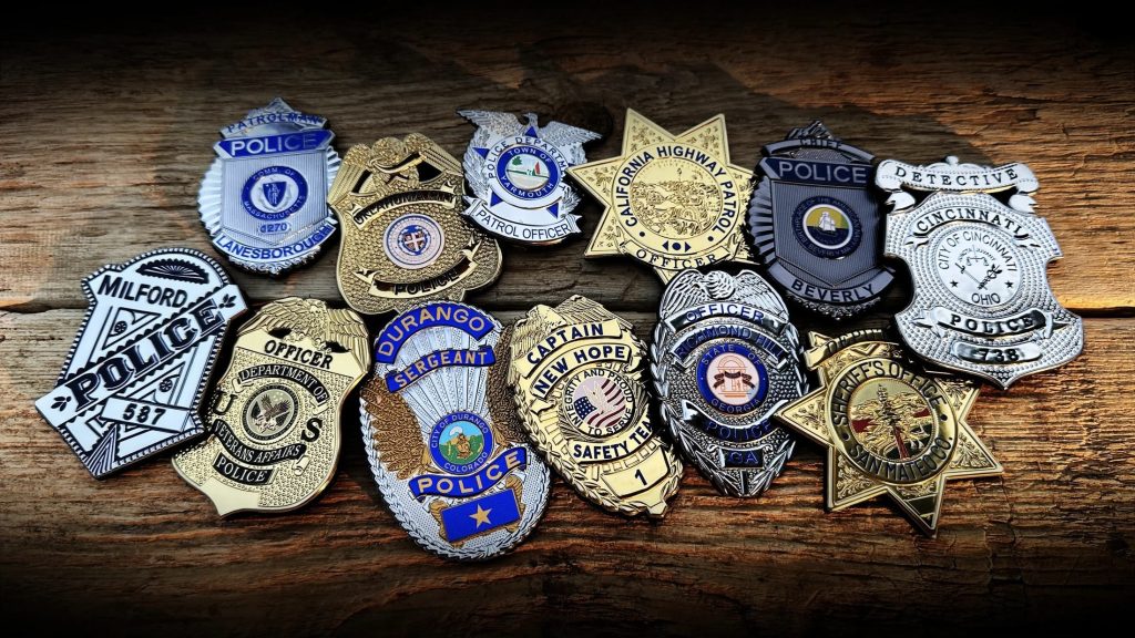
Color and shape establish much of a badge’s visual identity before the viewer reads its lettering. A traditional shield communicates a different impression from a circular emblem or a crest with an elaborate upper edge. Selecting the silhouette early helps determine how the remaining design elements should be arranged.
Shield-shaped badges remain a recognizable option because they provide a central area for an emblem and enough surrounding space for organization names, titles, or commemorative wording. Other silhouettes may suit collectible projects, special events, or fictional organizations, provided the design is appropriate for its intended use.
Enamel colors can introduce contrast and organize information. Dark blue paired with silver or gold creates a traditional appearance, while black and metallic finishes can produce a more understated effect. Additional colors may be used to distinguish an emblem or highlight a particular section, but excessive color variation can make a small design feel crowded.
Color selection should account for both appearance and production feasibility. Very small colored sections, thin dividing lines, and intricate patterns may be difficult to reproduce consistently. Artwork should allow enough space for individual elements to remain distinct after manufacturing.
Lettering requires similar attention. Long department names and multiple lines of text can compete with the central emblem for space. Buyers may need to adjust the arrangement, reduce unnecessary wording, or prioritize the most important information.
Before approving the final artwork, review the design at approximately its intended physical size. Details that look clear on a large computer screen may become less noticeable when reduced. Checking the silhouette, text, color contrast, and spacing together helps prevent avoidable revisions later.
From Artwork to Finished Badge: Understanding the Process
A custom metal badge typically moves through several stages, from initial design preparation to final inspection. The exact manufacturing method depends on the selected material, construction, relief, finish, and other product requirements.
The process begins with artwork and specifications. Buyers provide the design reference, preferred dimensions, outline, wording, colors, finish, and any special details. If the project is based on an existing badge, clear reference images can help communicate its proportions and decorative features.
Next, the artwork is reviewed for production suitability. Small text, narrow gaps, fine borders, and complex raised details may need adjustments to ensure that the finished design remains legible. Any changes should be discussed before production proceeds.
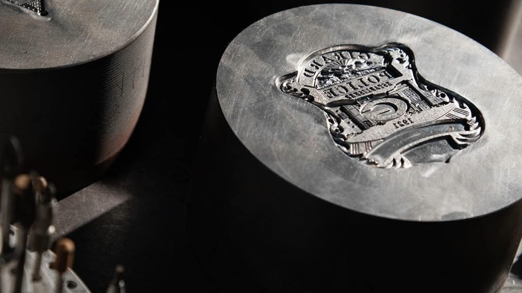
Depending on the chosen construction, the metal design may be formed using an appropriate stamping, die-striking, casting, or other manufacturing process. The surface is then finished according to the approved specification. Where the design includes enamel, the selected colors are applied to the designated areas as required by the production method.
After finishing, the pieces are checked for visual consistency, including shape, surface appearance, color placement, lettering, and noticeable defects. The specific inspection criteria should be agreed upon according to the project requirements.
For more complex designs, reviewing a digital proof or sample before approving a full production run can reduce misunderstandings. Buyers should confirm important details in writing, particularly when the artwork includes small text, multiple finishes, or several color sections.
Clear communication at each stage helps align the finished product with the approved design. It also gives both the buyer and manufacturer a shared reference for evaluating the final result.
Applications for Custom Police Badge Projects
Police badge designs can serve different purposes, and the intended application should guide decisions about appearance, materials, and presentation. A badge created for a historical display may prioritize period-inspired details, while a commemorative item may place greater emphasis on dates, event names, or symbolic artwork.
Historical and heritage collections benefit from designs that preserve distinctive visual features associated with a particular period or organization. Antique finishes, traditional lettering, and carefully arranged decorative borders can help establish the desired atmosphere.
Anniversary and commemorative projects may incorporate milestone dates, organizational emblems, or meaningful wording. The layout should give these elements enough space to remain readable without overwhelming the main design.
Recognition and presentation pieces often benefit from a refined finish and a balanced composition. Depending on the project, packaging or a display case may help protect the item and make it suitable for presentation.
Private collectibles and themed displays offer greater flexibility in shape, color, and visual style. Designers can explore vintage-inspired artwork, modern interpretations, or fictional insignia without suggesting that the piece is an official credential.
The intended use also affects how a badge should be described and distributed. Police insignia, protected emblems, and official identifiers may be subject to legal or organizational restrictions. Buyers should confirm that they have the necessary authorization before reproducing real departmental insignia, titles, or identifying marks.
For projects intended as decorative collectibles or commemorative gifts, the design and marketing should accurately reflect that purpose. Clear specifications and appropriate presentation help distinguish a custom collectible from an official badge used in law enforcement.
What to Check Before Ordering Custom Badges
A well-prepared order starts with more than a reference image. Buyers should communicate the practical requirements of the project so that the proposed design, manufacturing method, and finished product can be evaluated against the same expectations.
| Item to confirm | Questions to consider |
|---|---|
| Design and artwork | Is the final artwork approved, and are all text elements correct? |
| Shape and dimensions | Are the outline, height, width, and proportions clearly specified? |
| Material and construction | Which material and manufacturing method suit the design? |
| Surface finish | Is the preference polished gold, antique silver, black nickel, or another finish? |
| Relief and lettering | Are raised details clear, and is small text likely to remain readable? |
| Color and enamel | Are color references and the placement of each color clearly indicated? |
| Quantity and budget | What quantity is required, and how does design complexity affect the quotation? |
| Production schedule | What proofing, production, and shipping time should be allowed? |
| Quality inspection | Which visual and dimensional details must be checked before acceptance? |
| Authorization | Does the project have permission to reproduce the relevant insignia or protected marks? |
Quantity and design complexity can affect the available production options and the overall quotation. Instead of assuming a universal minimum order quantity or fixed lead time, buyers should request project-specific information based on their artwork and requirements.
It is also useful to ask how design revisions are handled, whether a sample or proof is available, and which inspection details will be confirmed before shipment. These questions are especially important when several badge designs are being produced within one collection.
Packaging should be considered at the same time as the badge itself. Individual protective packaging may be appropriate for storage and distribution, while a presentation box may better suit commemorative gifts or display pieces. The choice should match the product’s intended use and budget.
A concise specification sheet can bring these details together and reduce the chance of conflicting expectations. It gives the manufacturer a clearer basis for evaluating feasibility and preparing an accurate quotation.
Exploring the Vintage & Modern Police Badge Collection with Green Tree Gifts
The Vintage & Modern Police Badge Collection highlights how silhouette, surface finish, relief, color, and lettering can shape the character of a custom metal design. Traditional styles offer decorative detail and a sense of heritage, while modern styles emphasize clarity, controlled contrast, and streamlined composition. Designs that combine the two approaches can also create a distinctive balance between historical influence and contemporary presentation.
For buyers developing a custom badge project, the most useful starting point is a clear brief. Identify the intended application, preferred visual direction, approximate dimensions, required wording, finish, color scheme, quantity, and target schedule. Reference images can help communicate the desired appearance, while written specifications clarify which details must be preserved.
Green Tree Gifts is a China-based manufacturer specializing in custom challenge coins, lapel pins, medals, badges, patches, belt buckles and other metal promotional products. For suitable custom metal projects, the team can review supplied artwork and product requirements to help establish the next steps for a quotation and production discussion.
Whether you prefer an antique finish with intricate raised details or a cleaner design with polished metal and restrained color, a successful result begins with careful planning and clear communication. The aim is to create a product whose visual details suit its intended purpose and whose specifications are understood before production begins.