
How to Make Small Text and Fine Details Work on Custom Lapel Pins
Custom lapel pins are often small, but their designs can carry a lot of information. Company logos, commemorative dates, intricate symbols, and detailed illustrations all need to remain recognizable when translated into a compact metal product. However, small text and fine details can become difficult to reproduce when the artwork is too crowded or the production method is not suited to the design.
The key is to balance detail with readability. By choosing suitable lettering, simplifying unnecessary elements, adjusting spacing, and selecting the right manufacturing technique, businesses can create custom lapel pins that preserve their intended appearance without sacrificing clarity.
Whether you are designing corporate logo pins, employee recognition pins, event souvenirs, or collectible designs, understanding these factors before production can help you make better design decisions.
Why Small Text and Fine Details Can Be Challenging
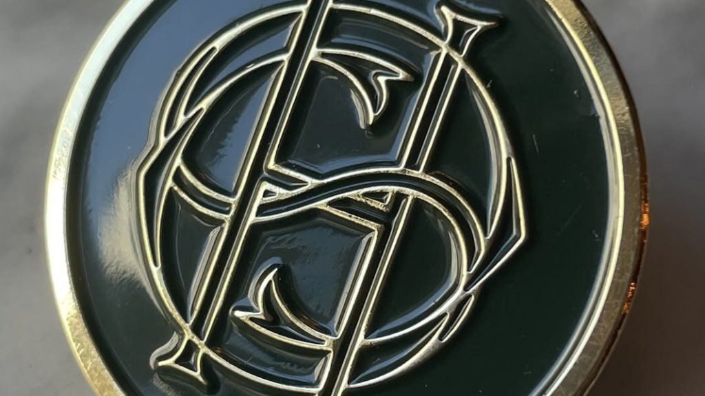
A design that looks clear on a computer screen may not work equally well on a finished lapel pin. Digital artwork can be enlarged for inspection, but a physical pin has fixed dimensions and limited space. Every letter, line, and color area must fit within that space.
Several common issues can affect the final appearance.
Small lettering becomes difficult to read. Long company names, slogans, dates, and department titles can take up considerable space. When the lettering is reduced too much, individual characters may become difficult to distinguish, particularly when the font contains thin strokes or tightly spaced letters.
Fine lines lose definition. Intricate illustrations often use thin outlines to show facial features, architectural details, decorative borders, or small symbols. If these lines are too delicate for the chosen production process, the details may appear less distinct than intended.
Closely spaced elements blend together. Small gaps between letters, outlines, and decorative shapes can disappear visually when a design is reproduced at a reduced size. This is especially important for enamel pins, where metal borders separate different colored areas.
Complex logos become crowded. Some corporate logos contain several symbols, small text, and multiple colors. Trying to reproduce every element on a small pin can make the overall design feel busy and reduce brand recognition.
Color details compete for space. Designs with many small color sections may require more separation between elements. If the artwork is too crowded, the finished pin may not communicate the original design as clearly as expected.
These challenges do not necessarily mean that a detailed design is unsuitable for a lapel pin. In many cases, a few adjustments to the artwork can make a significant difference.
Practical Design Tips for Small Text and Fine Details
A successful design does not need to reproduce every detail of the original artwork. It needs to preserve the elements that make the design recognizable.
Choose Clear, Readable Fonts
Typography is one of the most important considerations when a lapel pin includes text. Simple lettering is generally easier to reproduce at small sizes than highly decorative fonts.
For company names, initials, dates, and short messages, consider fonts with clearly defined characters and sufficient space between letters. Avoid unnecessarily thin strokes, tightly condensed lettering, and elaborate decorative styles when the available space is limited.
It is also important to consider the length of the text. A short company name may fit comfortably, while a full company name combined with a slogan and date may create a crowded design.
If the text is essential, give it priority. If it is secondary information, consider shortening it or placing it on the reverse side when the design and manufacturing method allow.
Simplify the Artwork Without Losing Its Identity
Simplifying a design does not mean removing everything that makes it distinctive. The goal is to retain the most recognizable elements while reducing unnecessary complexity.
For a corporate logo, this might mean keeping the main symbol and company name while removing tiny decorative details. For a commemorative pin, the central image and date may be more important than a complex background pattern.
Before submitting artwork, ask three questions:
Which elements must remain recognizable?
Which details are decorative rather than essential?
Can any text, symbol, or background element be removed without changing the meaning?
This approach is particularly useful when adapting existing logos for small promotional products. A logo designed for a website or large sign may need a simplified version to work well on a compact metal pin.
Maintain Sufficient Spacing
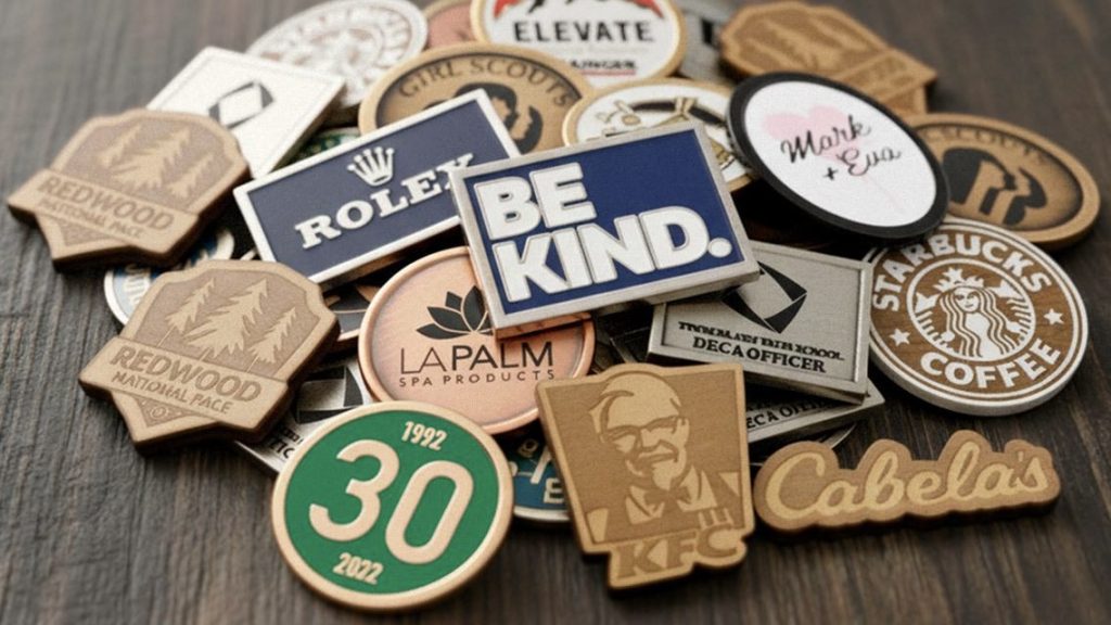
Spacing is just as important as the size of individual elements. Letters, lines, and adjacent shapes need enough separation to remain visually distinct.
Review the spaces between letters, the distance between an outline and the edge of the pin, and the gaps between neighboring color areas. If several elements sit too close together, the design may become difficult to interpret.
This is especially relevant when using enamel. Metal outlines help define the colored sections, so an artwork file with many narrow spaces may require adjustment before production.
Do not judge spacing only by zooming in on a screen. Reviewing the design at its intended physical size gives a more realistic impression of how it will look when worn.
Use Color Strategically
Color can improve recognition, but too many colors may make a small design harder to read. A limited palette often works well for corporate logo pins because it keeps the visual hierarchy clear and makes the main symbol easier to identify.
When using multiple colors, ensure that adjacent areas are visually distinct. Contrast between the enamel colors, metal borders, and background can help important elements stand out.
Metal finishes also influence the overall appearance. Gold, silver, antique finishes, and darker plating options create different visual effects. The selected finish should complement the artwork rather than compete with it.
For businesses that need consistent brand colors, provide clear color references and review the proposed design before production. The final appearance can be influenced by the selected materials, finish, and manufacturing process, so artwork approval is an important step.
Consider the Shape and Overall Layout
The shape of a lapel pin affects how much space is available for the artwork. A wide design may accommodate a longer company name, while a narrow or irregular shape may require a more compact layout.
Avoid forcing too much information into a shape that does not support it. Instead, arrange the elements according to their importance.
For example, a circular anniversary pin might place the main symbol in the center and the year around the edge. A shield-shaped corporate pin could emphasize the company emblem, while a rectangular pin might provide more room for lettering.
The objective is to make the design feel balanced, not simply to fit every element into the available space.
Which Production Technique Is Best for Detailed Lapel Pins?
The production technique should match the type of artwork being reproduced. Some methods are well suited to clear metal outlines and raised details, while others offer more flexibility for complex printed graphics.
| Production method | Best suited for | Design considerations |
|---|---|---|
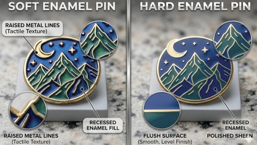
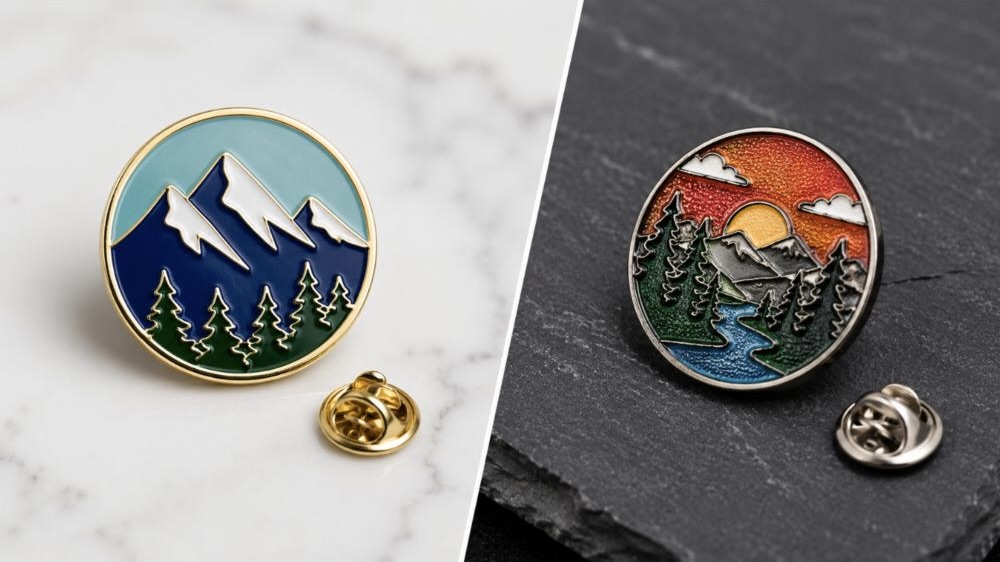
| Soft enamel | Colorful logos and designs with distinct metal borders | Recessed color areas and raised metal lines create a textured appearance. Small sections need sufficient space. |
| Hard enamel | Clean, polished designs with defined color areas | The smooth surface creates a more uniform finish, but crowded artwork may still need simplification. |
| Die-struck | Designs that rely on raised and recessed metal details | Works well for many classic and minimalist designs without enamel filling. Very intricate relief details require careful review. |
| Printed pins | Complex illustrations, fine graphic elements, and certain gradients | Can accommodate artwork that is difficult to separate into individual enamel areas. Print clarity depends on the design, size, and process. |
Soft Enamel Pins
Soft enamel pins use recessed colored areas separated by raised metal borders. This structure can create a distinctive contrast between the metal and the enamel.
They are often suitable for company logos, team pins, and promotional designs with clearly defined shapes and color sections. However, if the artwork contains many tiny colored areas or narrow outlines, the design may need to be simplified.
Hard Enamel Pins
Hard enamel pins have a smooth, polished surface. They are often selected for corporate gifts, recognition pins, and designs that call for a refined appearance.
A smooth finish does not automatically make every small detail readable. Fine lettering and closely spaced shapes still need to be evaluated according to the finished dimensions and the selected production process.
Die-Struck Pins
Die-struck pins use raised and recessed metal details to create the design without enamel color filling. This method can be effective for simple logos, initials, anniversary designs, and graphics that rely on metal relief.
For highly intricate artwork, consider whether the most important details can be represented clearly through the available relief. Simplifying decorative elements may help the main design stand out.
Printed Pins
Printed pins are worth considering when a design contains detailed illustrations, small graphic elements, or color transitions that are difficult to reproduce with traditional metal borders.
They can offer more flexibility for certain types of artwork, but the final result still depends on the pin size, image quality, and production method. Ask the manufacturer to assess the artwork rather than assuming that printing will reproduce every detail perfectly.
Ultimately, no single technique is best for every detailed design. The most suitable option depends on the artwork, the desired appearance, the budget, and the intended use.
From Artwork to Finished Lapel Pins: What Should You Check?
Good results depend on more than the initial design. Reviewing the artwork before production helps identify potential problems while changes are still relatively straightforward.
Prepare suitable artwork. Vector files are generally useful for logos and clean outlines because they can be resized without the same loss of sharpness associated with raster images. For printed designs, a high-resolution image may be appropriate. Confirm the preferred file format with the manufacturer.
Confirm the finished dimensions. A design that looks detailed at a large scale may become crowded when reduced to the actual pin size. Check the intended width and height before finalizing the layout.
Review text and line details. Pay particular attention to dates, initials, small company names, narrow gaps, and thin outlines. These elements should remain distinguishable at the intended size.
Discuss the production method. Share the artwork with the manufacturer and explain which details are most important. The manufacturer can assess whether the selected technique is suitable and identify areas that may require adjustment.
Check the proposed design proof. Before authorizing production, review the proposed layout, colors, metal finish, dimensions, and other specifications. Ask questions if any element appears unclear or differs from the approved artwork.
Inspect samples when appropriate. For projects where fine details are critical, a sample or production proof may help you evaluate the actual appearance before proceeding with a larger order. Confirm the available sample process and requirements with the manufacturer.
A careful review process can reduce avoidable design problems and help ensure that the finished pins reflect the intended artwork.
Applications That Benefit from Clear, Detailed Lapel Pin Designs
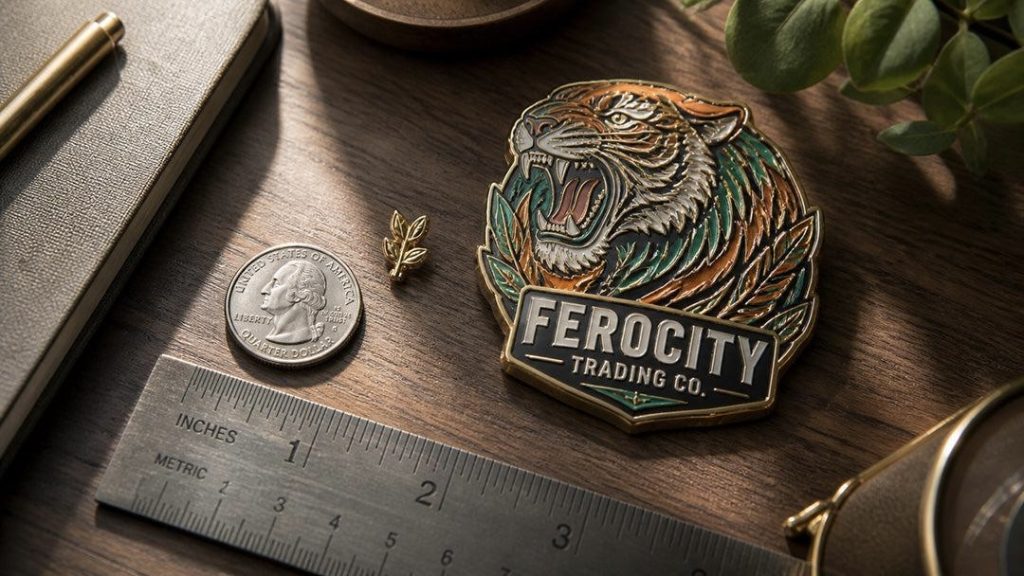
Small details matter in many types of custom lapel pins, but the most important design elements vary by application.
Corporate logo pins: Brand recognition is the priority. Keep the main logo clear, use consistent brand colors, and avoid including too much secondary text.
Employee recognition pins: Service years, achievement symbols, department names, and short messages can make the design meaningful. Make sure the key information remains legible rather than filling the pin with unnecessary decoration.
Event and commemorative pins: Event names, dates, and themed illustrations often distinguish one pin from another. A clear visual hierarchy helps participants recognize the occasion without overcrowding the artwork.
Membership and organization pins: Emblems, initials, and symbolic elements may carry particular significance. Simplify secondary details carefully while preserving the defining features of the organization.
Collectible and promotional pins: Detailed artwork can contribute to a distinctive appearance, especially for themed designs and limited-edition collections. Select a production method that supports the intended visual style.
In each case, the best result comes from matching the design to its purpose. More detail is not always better; the right details are the ones that remain clear and meaningful on the finished product.
Custom Lapel Pins from Green Tree Gifts
Green Tree Gifts is a China-based manufacturer specializing in custom lapel pins, challenge coins, medals, badges, patches, and other metal promotional products.
For lapel pins with small text or intricate graphics, buyers can provide their logo or reference artwork, preferred dimensions, quantity, finish, and intended application. These details help the manufacturer evaluate the design and discuss suitable production options.
If certain lettering, symbols, or decorative features must remain recognizable, identify them before production. This allows the artwork and manufacturing method to be reviewed with those priorities in mind.
Whether the project involves corporate branding, employee recognition, or event merchandise, careful artwork preparation and clear communication can help create a finished pin that reflects the original design.
Frequently Asked Questions
Can small text be used on custom lapel pins?
Yes. Readability depends on the lettering, spacing, pin dimensions, and production method. Review essential text at the intended physical size before production.
Which lapel pin technique is best for detailed logos?
Printed pins can suit complex graphics, while enamel and die-struck methods work well for many designs with defined outlines or raised metal details. The best choice depends on the artwork.
Should I simplify my company logo before ordering?
If the logo contains tiny text, thin lines, or crowded elements, simplifying selected details may improve clarity while preserving the main brand identity.
Can a manufacturer review my artwork before production?
Yes. Share the design, intended dimensions, and preferred production method so the manufacturer can assess potential limitations and discuss adjustments.
Planning a custom lapel pin with fine details? Request a custom quote from Green Tree Gifts.
Explore more from Green Tree Gifts: Custom Lapel Pins | Custom Challenge Coins | Custom Patches | Contact Us