
Table of Contents
Jack-o' Lantern to Enamel: Translating Halloween Artwork Into Metal
The file she sent was genuinely good. A jack-o’-lantern grinning in the dark, orange light bleeding out of the carved eyes into the night around them, a curl of smoke, a bat crossing the moon, and “HAPPY HALLOWEEN” in a spidery blackletter script along the bottom edge. On a 27-inch monitor at full zoom it looked like a poster.
The first sample came back looking like a different object entirely. The glow — the single thing that made the drawing work — was gone, replaced by a flat orange wedge that stopped at hard metal edges. The smoke had come out as four disconnected blobs. The blackletter text had fused into a smudge. And the deep near-black background, which carried the whole mood on screen, was simply absent, because a background isn’t a shape — there’s no well for enamel to sit in.
None of that was a manufacturing defect. All of it was predictable. Halloween artwork is the most consistently difficult source material in the pin business, and not because it’s bad art. It’s because the things that make it good on a screen — atmosphere, gradient, hairline detail, darkness — are precisely the things a die-struck piece of metal cannot do.
This is the translation guide: what survives the trip from pixels to enamel, what doesn’t, and how to fix it before you pay for a mold.
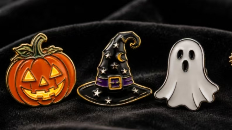
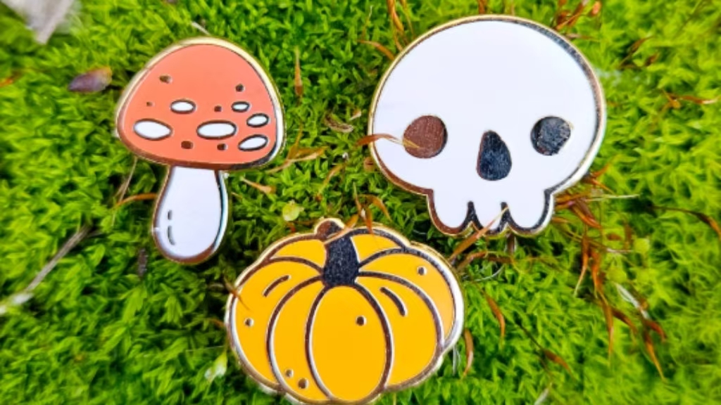
Why Halloween Art Fights the Process
An enamel pin is a stamped metal base with raised metal walls forming the outline of every shape. Liquid or paste enamel is filled into the recessed wells between those walls, then baked. The metal line is not decoration — it’s the container. Color can never touch color directly; every color region must be fully enclosed by metal.
The closest analogy is stained glass: the lead came is structural, and you design around it rather than pretending it isn’t there. Or think of a coloring book where a child has drawn heavy outlines — the ink channels decide where the crayon can go, and nothing crosses them.
Halloween illustration leans on four habits that collide with that structure:
Glow and gradient. Candlelight behind a carved pumpkin, fog, a moon halo. Enamel is a flat, solid fill. It cannot fade from orange to black inside a single well.
Atmospheric dark backgrounds. On screen, a shadowy gradient behind a ghost creates depth. In metal, background is either an air gap (a cutout) or nothing at all. There is no “dark wash” setting.
Hairline detail. Cobwebs, whiskers, wisps of smoke, thin outlines. Anything below the minimum metal width either breaks in the die or never fills cleanly.
Decorative type. Blackletter and script fonts at small sizes close up into solid black. Gothic lettering is the default Halloween font and the most common single cause of an unreadable pin.
The market makes this worth getting right. The National Retail Federation’s Halloween survey put total U.S. spending at a record 13.1 billion**, with **73%** of consumers planning to celebrate and average per-person spending around **114.45 — split roughly 4.3 billion on costumes, 4.2 billion on decorations, 3.9 billion on candy**, plus about **860 million on pet costumes. Nearly half of shoppers start buying in September or earlier. When a season is that crowded, the visuals are the entire competition, and a muddy pin loses to a crisp one at arm’s length.
Pick the Process Before You Finish Drawing
The single most expensive mistake is designing first and choosing the process second. Four routes exist, and each one wants a different drawing.
| Soft enamel | Hard enamel | Printed (UV / offset) | Die struck, no enamel |
Surface | Raised metal lines, recessed color — textured | Polished flat, color flush with metal | Flat printed image, often with epoxy dome | Bare metal, sandblasted or polished |
Gradients | No | No | Yes — full color, photographic | No |
Color count | Best at 4–6 | Best at 4–6 | Unlimited | None — metal tone only |
Feel in hand | Tactile, ridged | Glassy, jewelry-like | Smooth, glossy | Heavy, old-school |
Unit cost, 1″, 100 pcs | 1.20–3.00 | +20–30% over soft | Often lower than hard enamel | Mid-range |
Production | 10–15 business days | 15–21 business days | 10–15 business days | 10–15 business days |
Best Halloween use | Bold flat illustrations, cute characters, most orders | Collector editions, numbered sets, premium gifts | Painterly art, gradients, photo-based haunted house art | Silhouettes, bats, black cats, moon — where metal is the art |
A useful rule of thumb: if your artwork can’t survive being reduced to six flat colors and heavy outlines, it’s a printed pin. That’s not a downgrade — some of the best Halloween pins on the market are printed, because printing is the only way to keep a foggy graveyard looking foggy.
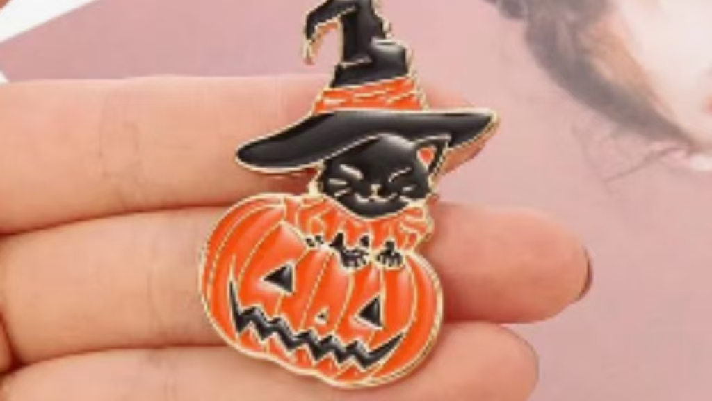
The Seven Rules That Decide Whether It Works
- Metal lines no thinner than 0.2–0.3 mm.Below roughly 0.2 mm, lines break during die-stamping or aren’t raised high enough to hold liquid enamel. Design at 0.3 mm if you’re unsure; it costs nothing and survives every factory’s tooling.
- Color areas no smaller than 0.3 mm.Tiny enclosed wells don’t fill cleanly and read as specks at 1 inch. If a detail is smaller than a grain of rice at actual size, delete it or merge it into a neighbor.
- Every shape must be closed.An open-ended line leaves nowhere for color to sit. Cobwebs are the classic offender — draw them as enclosed triangles against the background, not as floating strands.
- No gradients, no soft shadows, no blur.Each color is one flat fill. If you need the glow around a pumpkin eye, either make it a second flat orange ring or add screen-printed detail on top as a paid add-on.
- Text at 5–6 pt minimum, in a plain font, converted to outlines.Anything smaller or more ornamental than that closes up. If the design needs a fancy Halloween script, make it large or move it to the backing card, where ink has no minimum.
- Size between 0.75 and 1.5 inches — 1 to 1.25 for most Halloween pins.Fine detail that reads on screen disappears at pin scale. Bigger also costs more, because factories price metal by weight and larger pins need heavier clutches to sit straight on a jacket.
- Plating is a design decision, not a default.The exposed metal framing your whole pin comes in gold, silver/nickel, black nickel, copper, and antique finishes. Black nickel is the Halloween workhorse: it makes neon orange, acid green, and purple pop in a way shiny gold never will. Leaving a shape unfilled lets the plating become a color — which is how you get a black cat for the price of zero extra enamel.
Halloween Effects Worth Paying For
Effect | What it does | Best for | Watch out for |
Glow-in-the-dark enamel | Charges in light, glows green or blue in the dark | Ghosts, skeletons, eyes, “BOO” text | Replaces a color slot; paler in daylight than standard enamel |
Translucent / transparent enamel | Light passes through, like stained glass | Ghosts, slime, potion bottles, window panes | Looks darker over cutouts — test on the actual backing |
Glitter enamel | Suspended sparkle in the fill | Witch hats, potions, stars, candy | Adds cost; can read glittery rather than metallic at small sizes |
Black nickel plating | Dark, modern metal frame | Nearly everything Halloween | Shows fingerprints on large polished areas |
Antique plating | Darkened recesses, vintage feel | Haunted houses, apothecary labels, vintage circus | Mutes bright colors slightly |
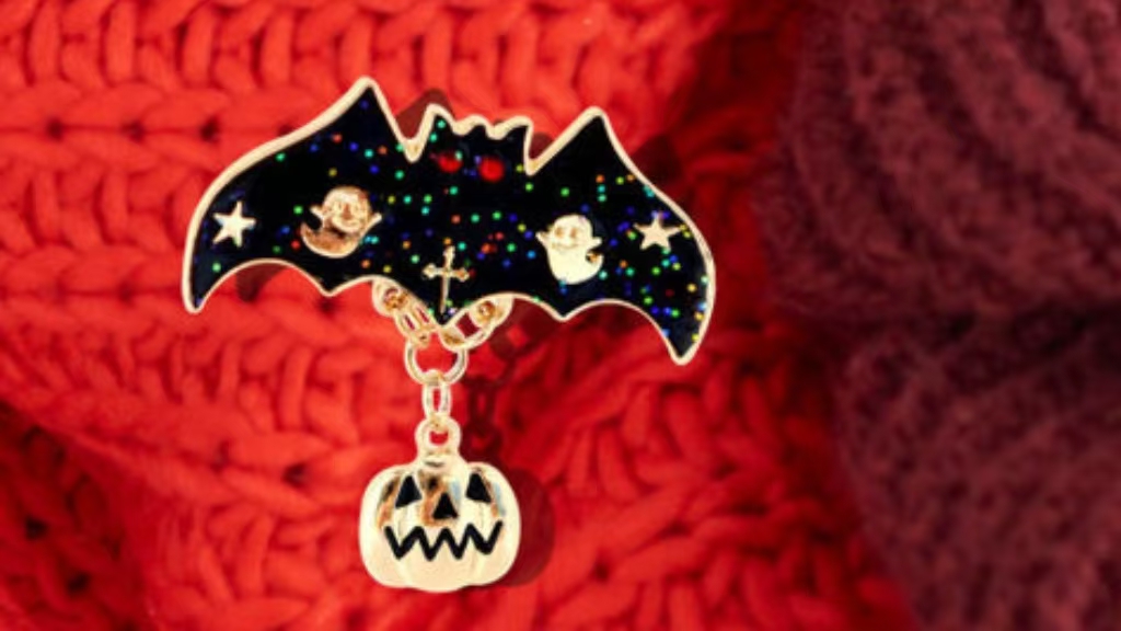
Cutouts | Open air where metal would be | Bat wings, moon crescents, negative space | Every cutout edge needs thickness; no floating islands |
Sliders, danglers, spinners | Moving element | A ghost sliding out of a pumpkin, a spinning tombstone | Adds assembly time and unit cost; order earlier |
Epoxy dome | Clear glossy coating | Printed pins, protection against scratches | Adds a slight lens effect — can blur fine text |
Two of these punch above their weight for Halloween specifically. Glow enamel is the one people remember: a pin that looks ordinary in an office and glows green in a dark bar is a pin that gets talked about. And black nickel is the cheapest upgrade on the list — it changes the entire read of a design without adding a single color.
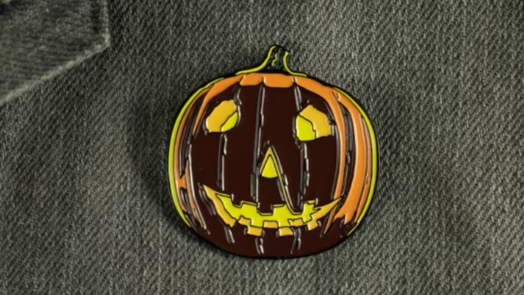
Five Fixes for the Most Common Halloween Problems
On screen | In metal | Fix it by |
Orange glow bleeding out of pumpkin eyes | Flat orange wedge with hard edges | Two flat orange tones — a lighter ring around a darker core — plus black nickel between them |
Curling smoke | Disconnected blobs or broken lines | Merge the curl into one thick closed shape, minimum 0.3 mm, and let the plating do the rest |
Cobweb in the corner | Invisible, or a tangle that won’t fill | Rebuild as three or four enclosed wedges; drop the fine radial threads |
“Happy Halloween” in blackletter at the bottom | Black smudge | Plain sans at 5–6 pt, or move the script to the backing card at any size you like |
Dark gradient background behind a ghost | Nothing — no well to fill | Make the ghost’s outline the pin’s outer silhouette and cut the background away entirely |
That last one is the rule worth internalizing: on a pin, a dark atmospheric background is usually dead weight. Cut it out, let the garment be the background, and the design gets sharper and cheaper at the same time.
The 2026 Timing Math
Halloween falls on Saturday, October 31, 2026 — the best possible night of the week for parties, events, and anything involving a crowd in costume. It also means distribution has to happen on or before Friday the 30th, and that the last week of October is pure execution with no time left for corrections.
Standard production runs 10–15 business days after artwork approval; hard enamel runs 15–21. Rush slots exist but compress into the same calendar everyone else is fighting over.
Step | 2026 window |
Finalize artwork (vector, Pantone, plating chosen) | Now — late September |
Submit and review digital proof | Within 2–3 days of submission |
Order placed, mold cut | No later than the first week of October |
Production and QC | 10–15 business days standard |
In hand | Mid-to-late October |
Distribution — events, parties, trunk-or-treat | October 24–30 |
Halloween | Saturday, October 31 |
Working backward from October 31, the artwork needs to be finished — not started — by the end of September. That’s the part people get wrong: the design decision is the long pole, not the factory.
What to Send Your Manufacturer
A clean submission takes ten minutes and removes most of the revision cycle:
- Vector file— AI, EPS, or SVG. Not a PNG, not a JPEG, not a Photoshop file with layers.
- All strokes expanded to fills.The die is cut from outlines; a live stroke can be interpreted differently by every factory.
- Pantone Solid Coated codesfor every color. Screen color and fired enamel are different systems, and PMS is the shared language between them.
- A marked-up layershowing which areas are raised metal and which are enamel wells.
- Finished size and backing— butterfly clutch is standard and free; rubber clutches hold better on lanyards and badge reels; locking or magnetic backs for coats and suit lapels.
Do that and the first proof usually needs one round of changes instead of four.